Create Joy Strategy
Create Joy
Brand
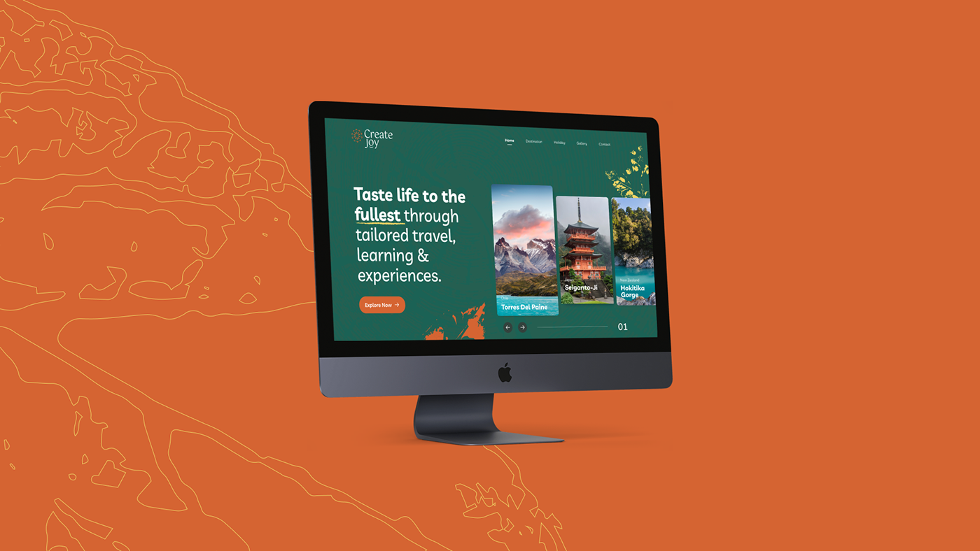
Create Joy helps people aiming to get out of their comfort zone and experience a new awakening to embrace the unknown, tasting life to the fullest through tailored travel, learning, and experiences. Unlike traditional travel agencies, Create Joy hold sustainability, inner growth, community, and education at its core, aspiring to impact the world positively. They believe life is a magical journey, and travel is an opportunity to go within, be mindful and become our best version.
The challenge
standing out from the crowd
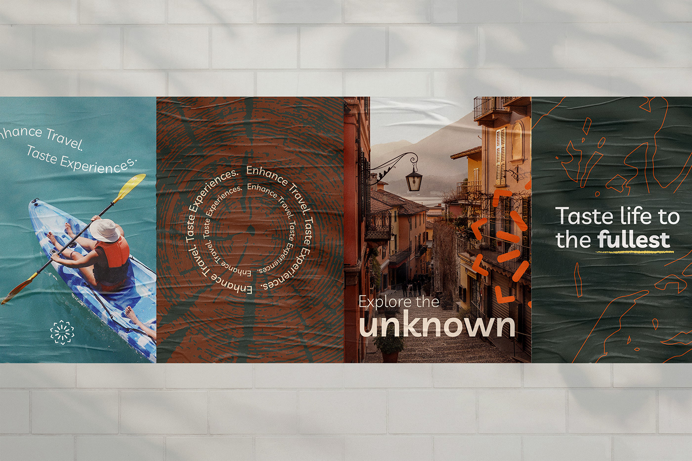
Our challenge was to differentiate Create Joy from the traditional travel industry approach that uses typical visuals a message that invites the audience to challenge themself to the extreme, be an adventure, and experience luxury.
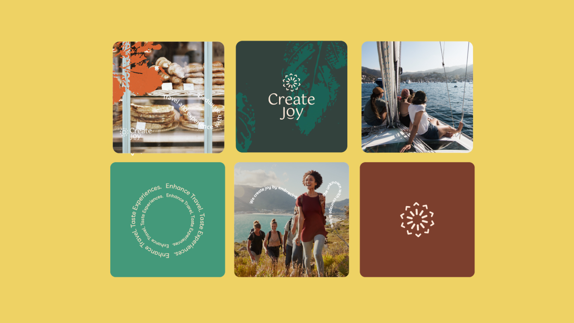
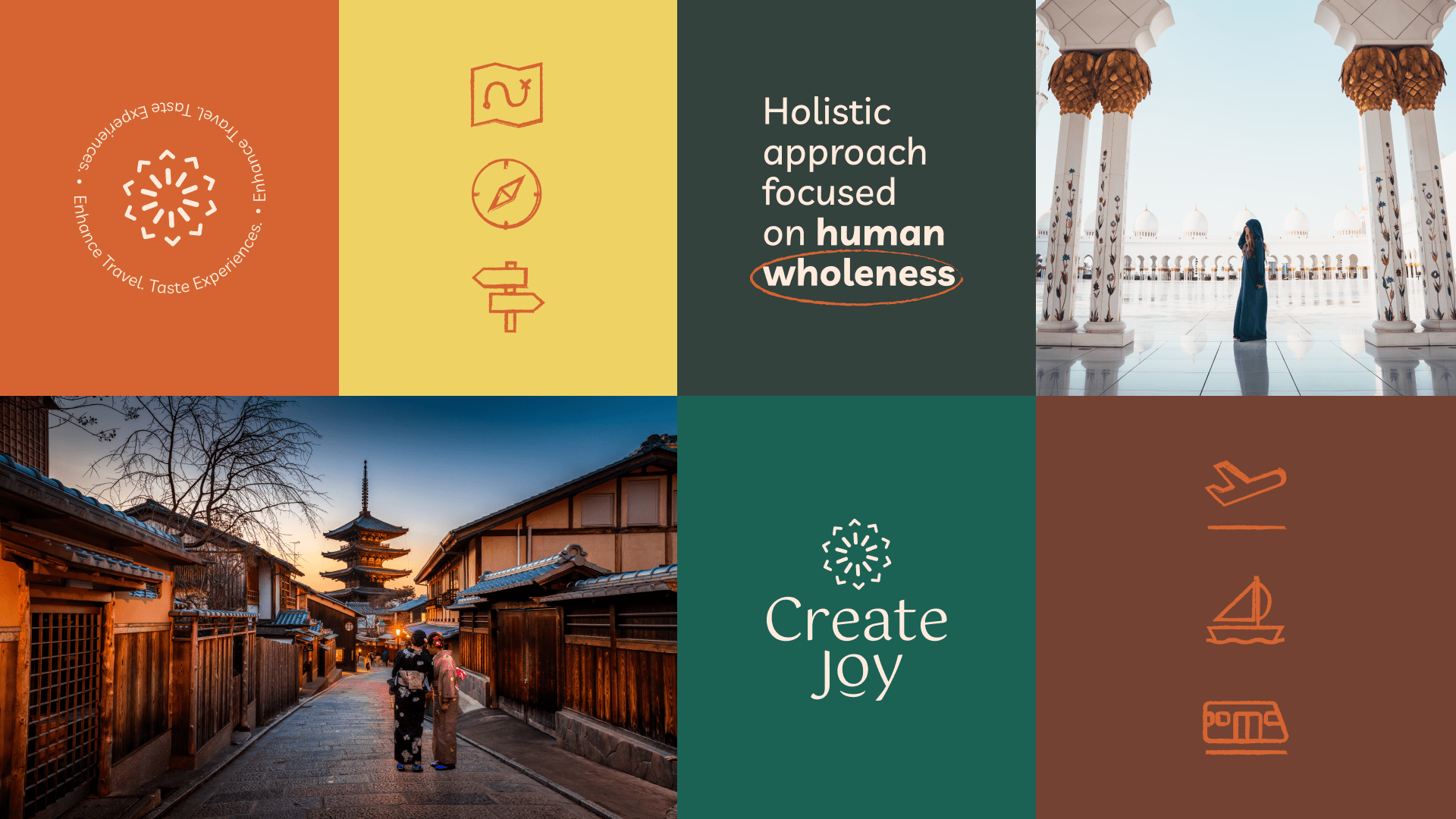
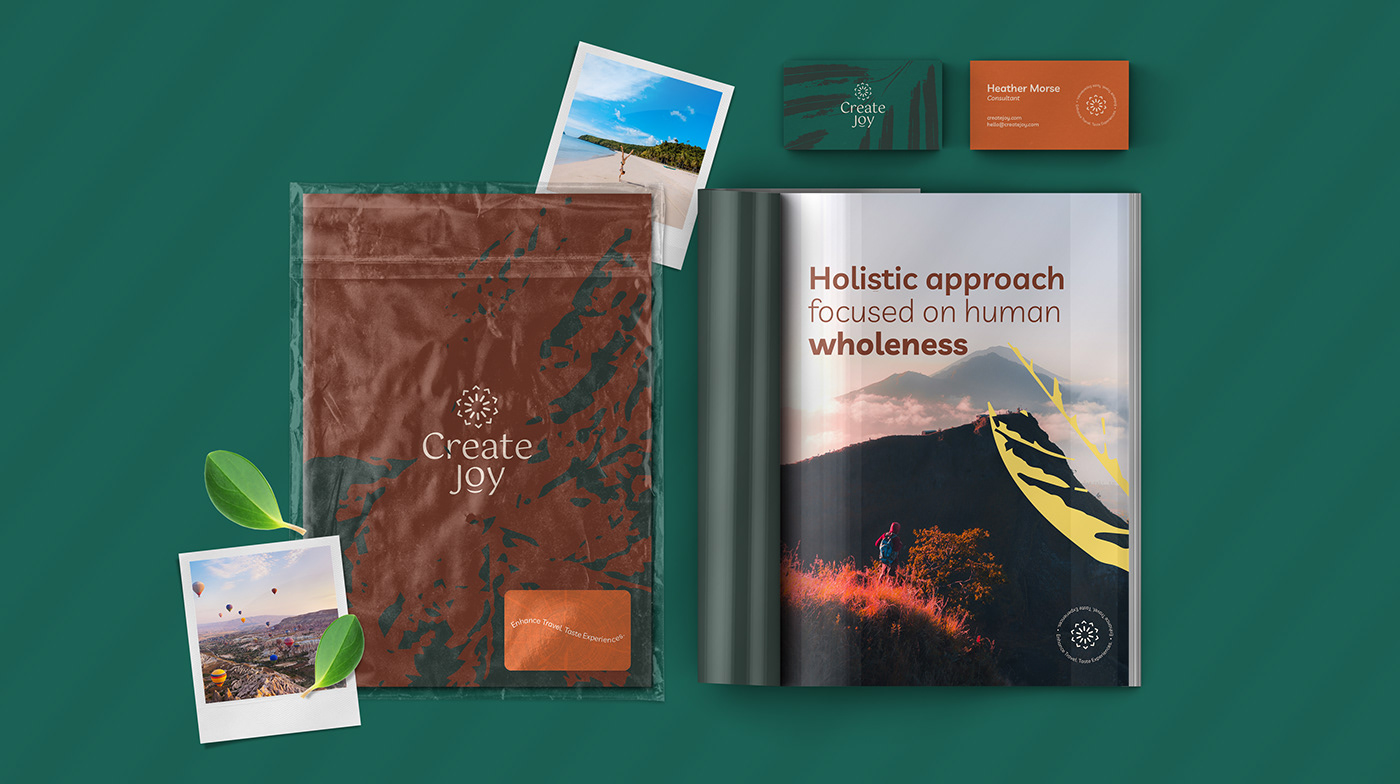
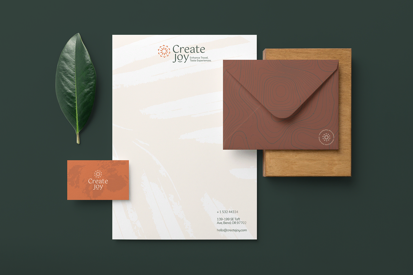
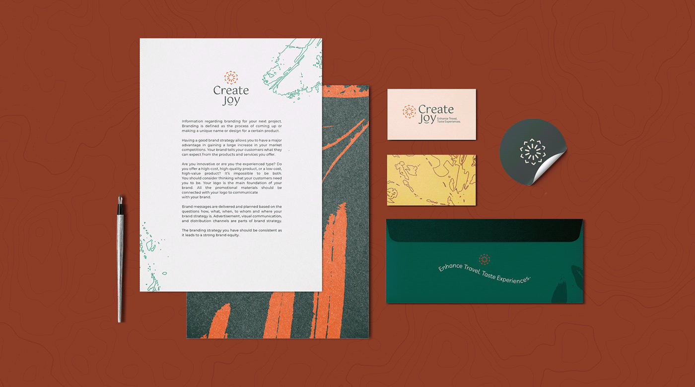
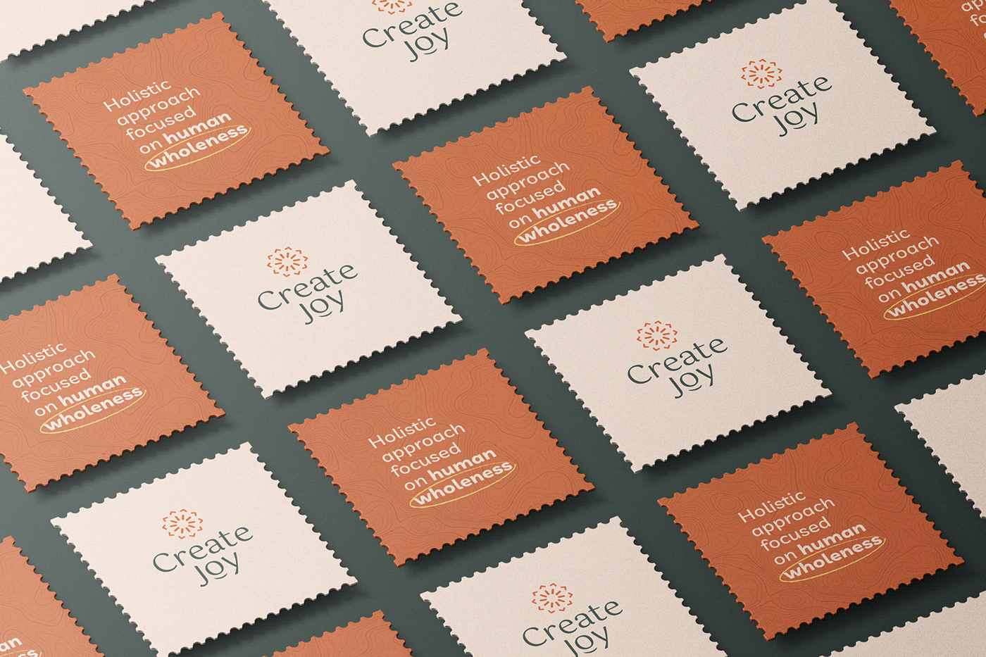
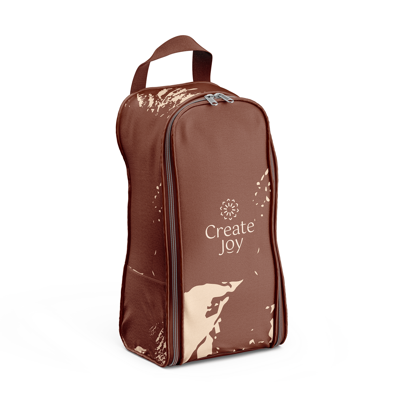
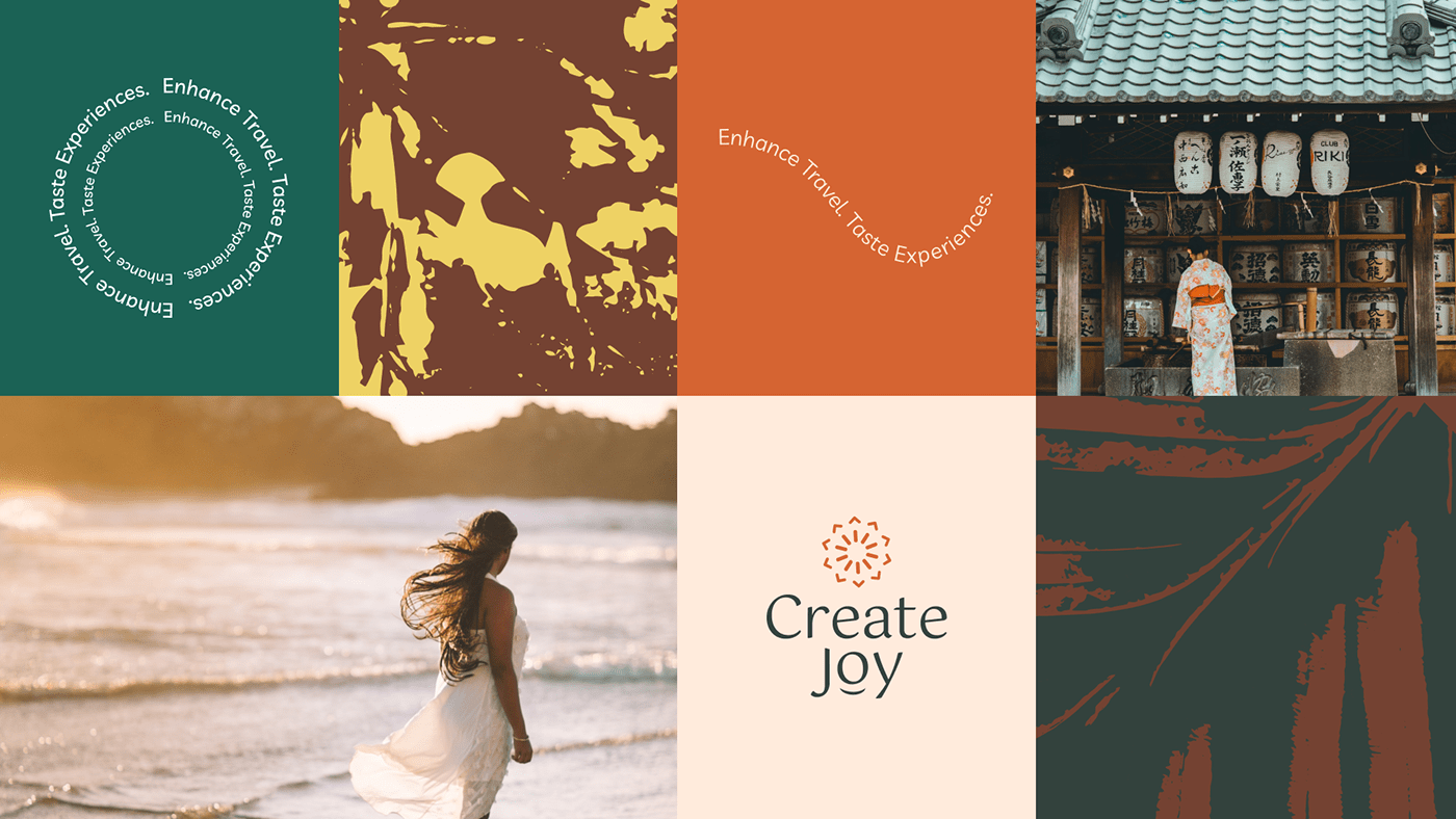
Instead of the traditional black/dark blue as the primary color chosen by conventional and classy travel brands, we created a balanced, colorful visual identity that connects people with nature, inviting them to explore the unknown and begin a journey of transformation. It’s joyful, warm, and inviting.
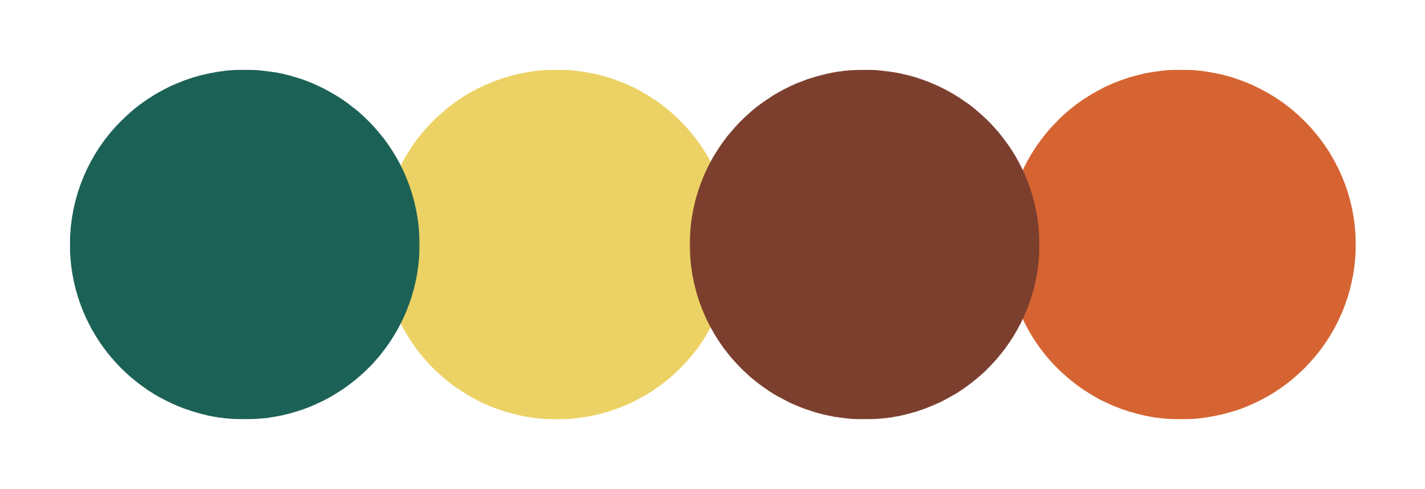
Color palette
Green: represent the earth, sustainability, the growth
Orange and yellow: the warmth, the joy, inviting
Brown: nature; balance
Emotional Design
inside-out transformation
The goal was to convey the inside-out concept of beginning a journey of self-awareness with a warm, inviting, approachable and friendly atmosphere.
Family Typeface
The Livvic Typeface brings a lot of personality to the visual system. It’s friendly, smooth, legible, and modern. It has 16 variations, bringing a lot of flexibility to the identity.


Creative Process
outside the box
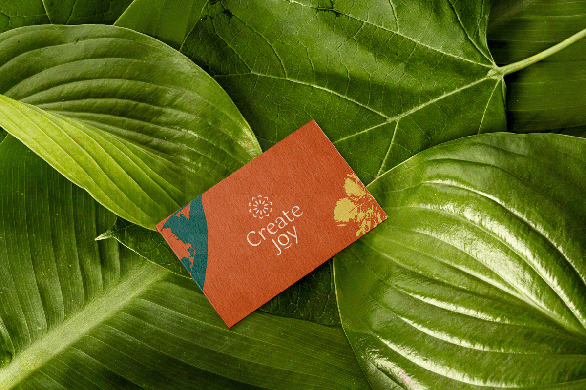
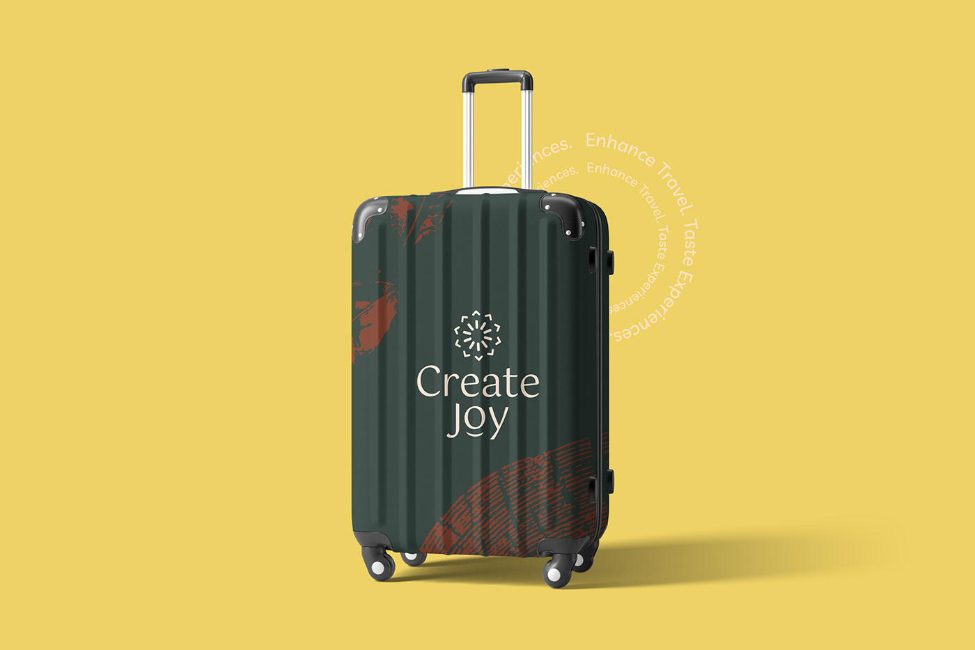
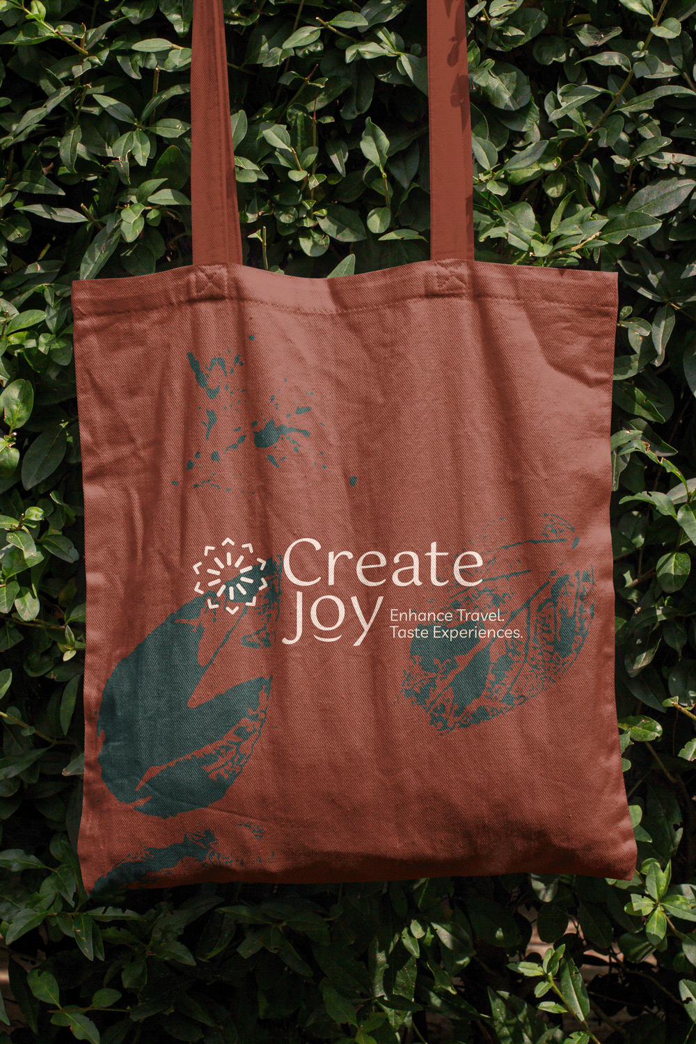
Personalized and handmade elements will be part of Create Joy’s visual communication emphasizing how the brand values sustainability, positive impact, and connection with nature, bringing more personality and visual richness to the brand, complementing the visual identity, and enabling numerous different combinations.

